Pokruszone

Branding / Packaging / Photography
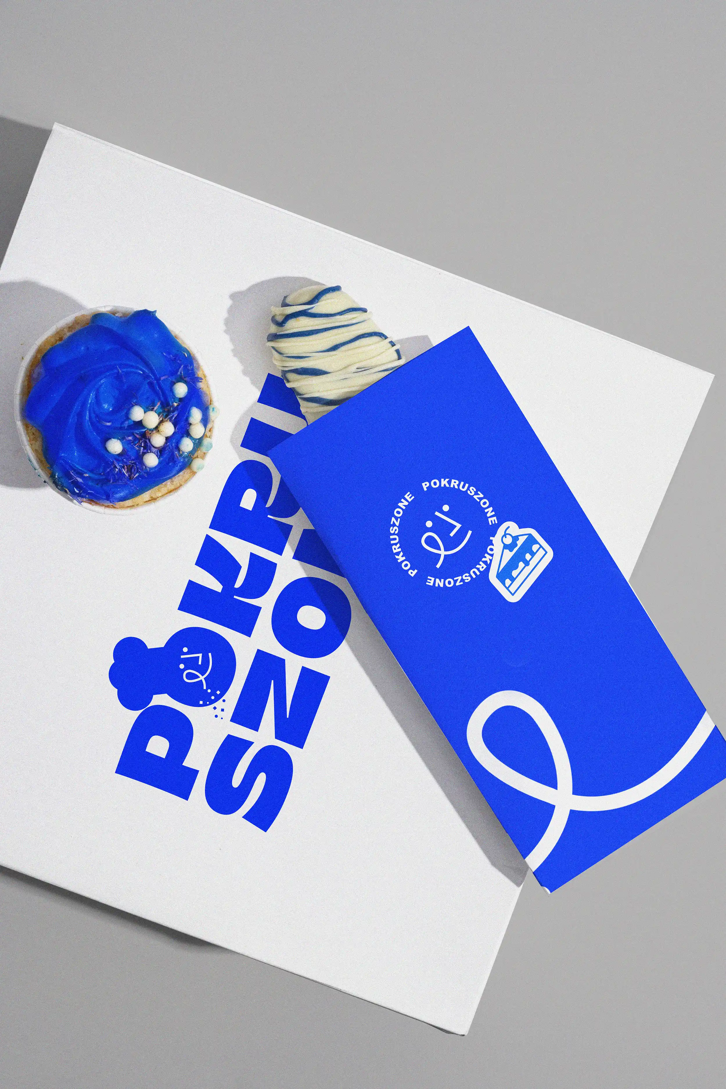
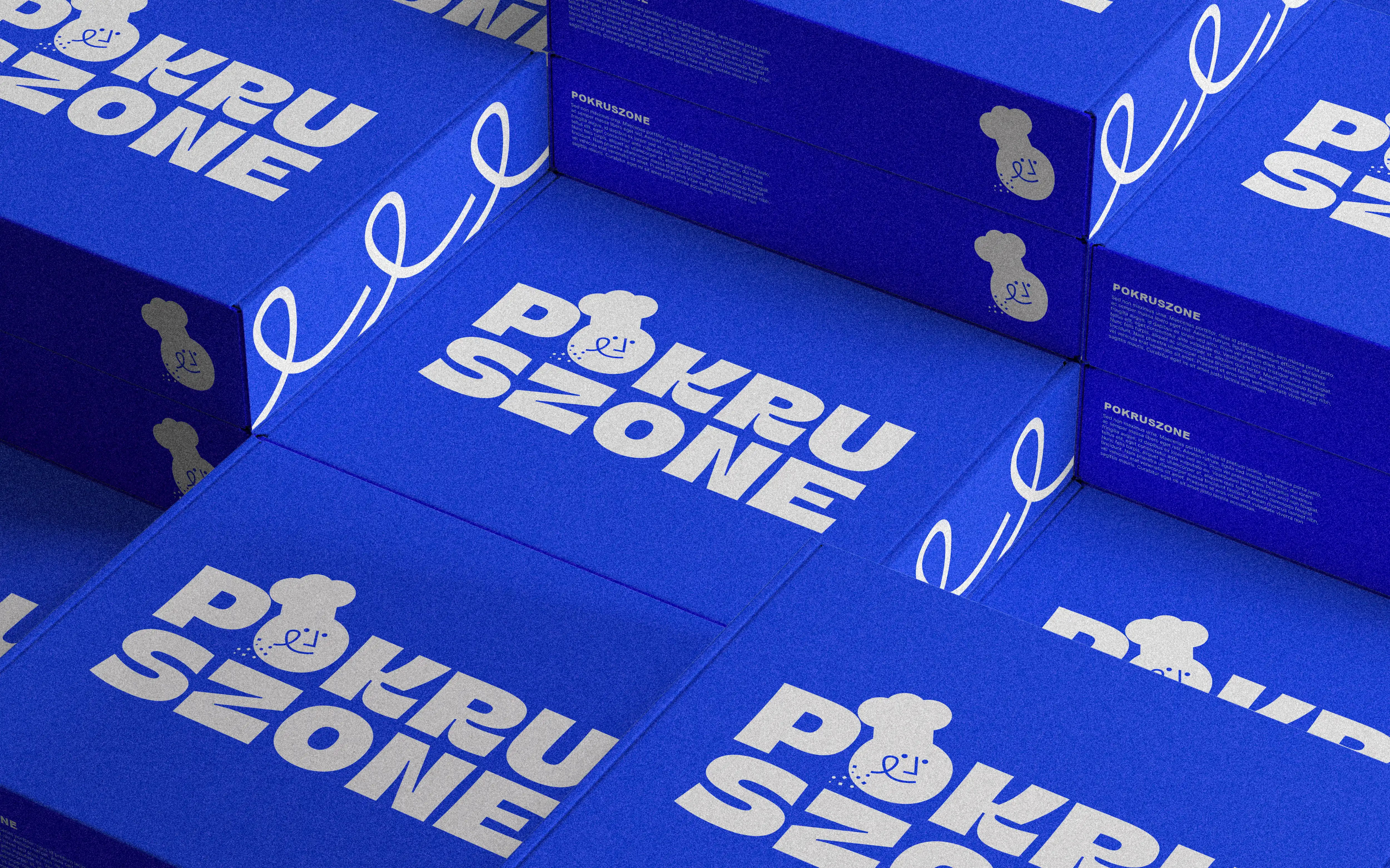
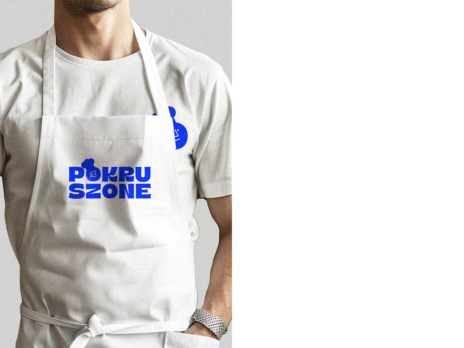
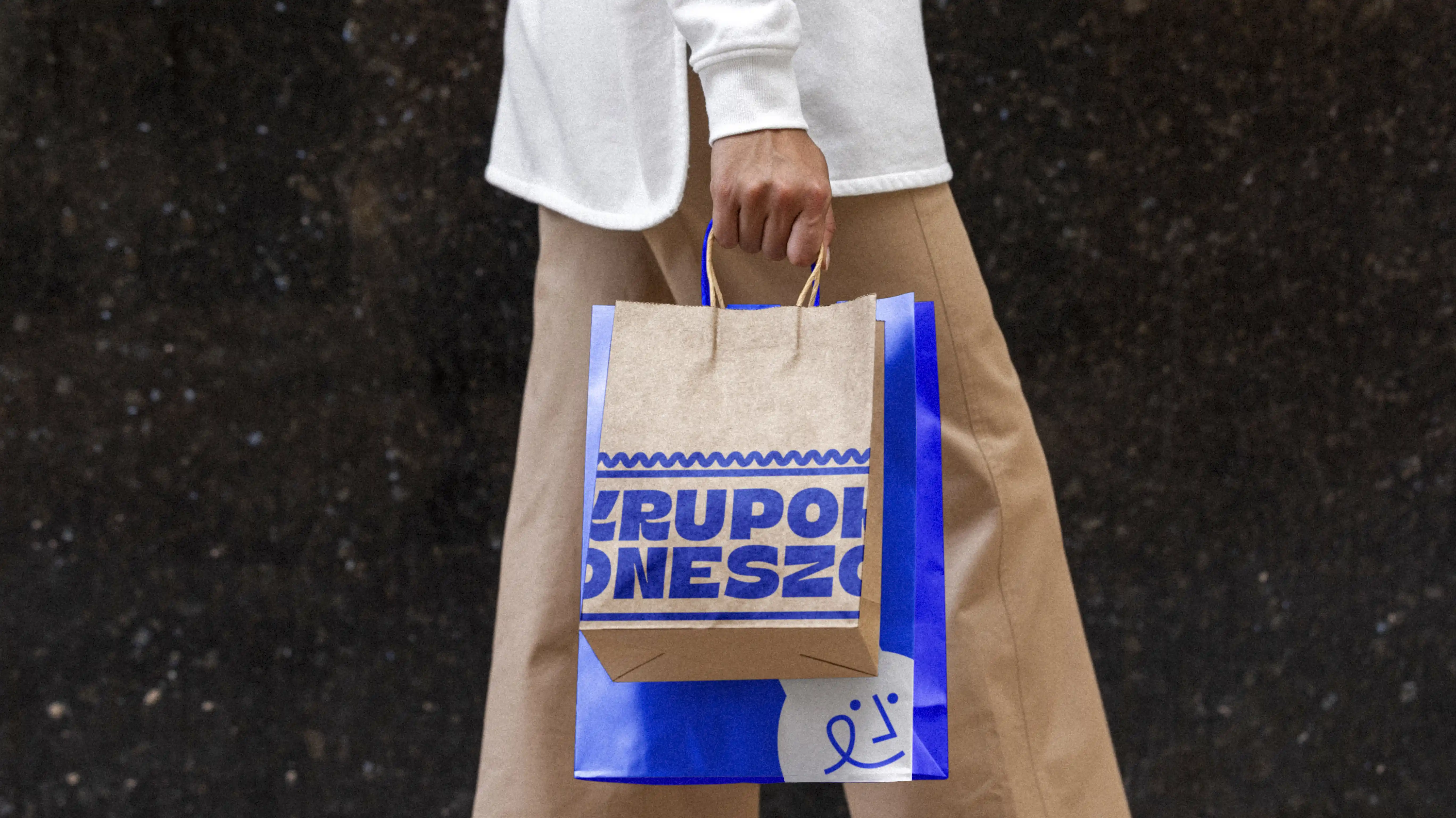
Pokruszone
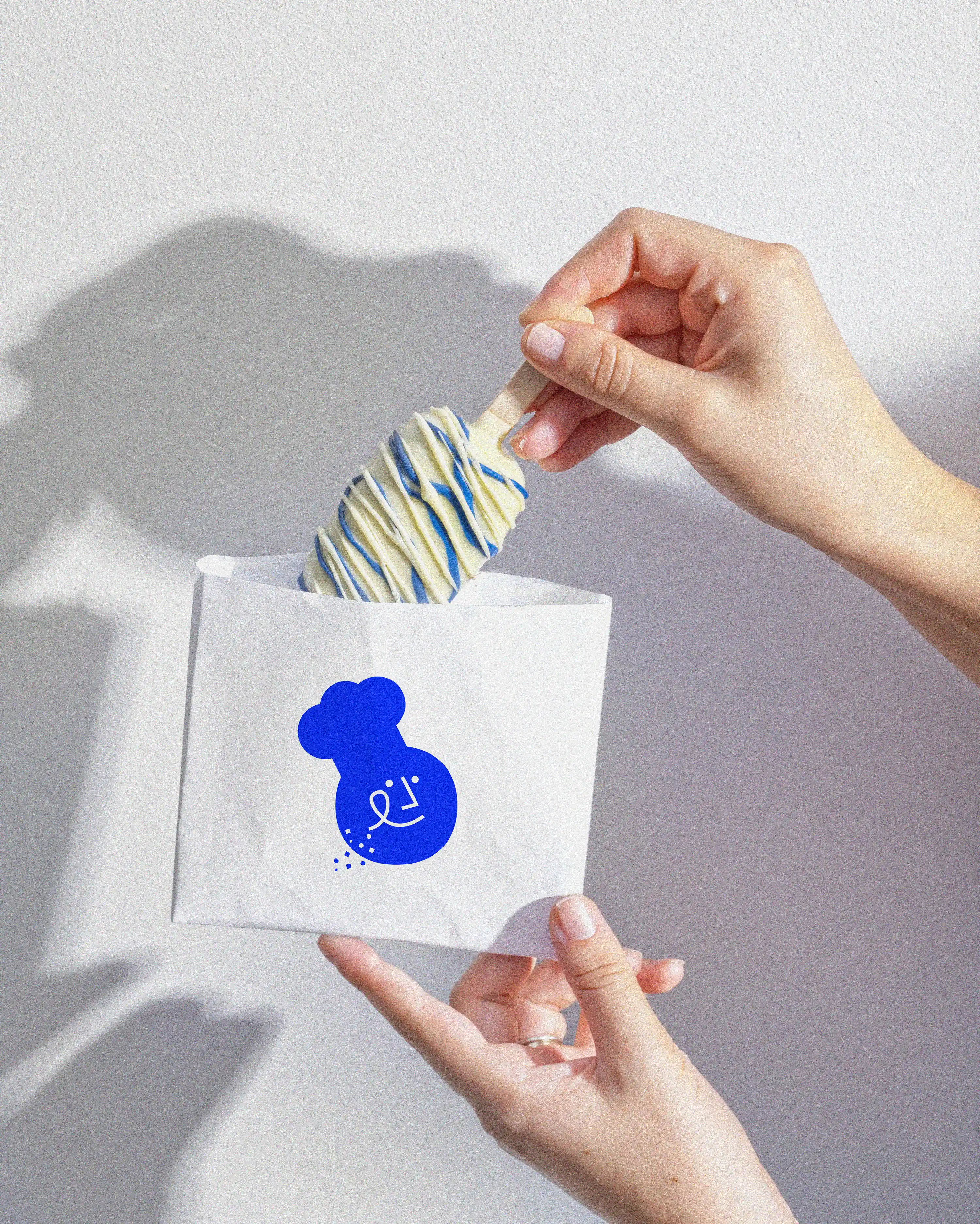
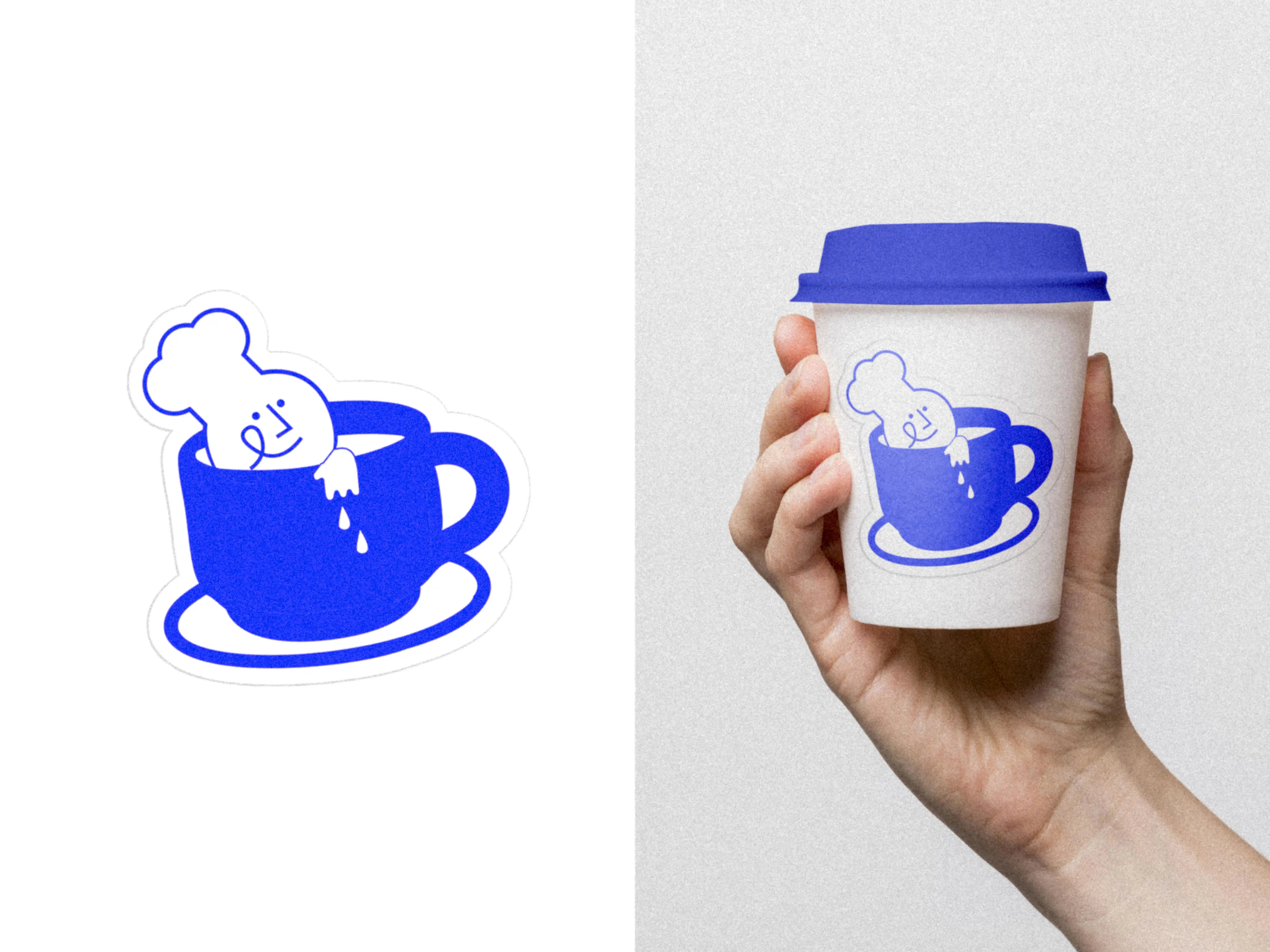
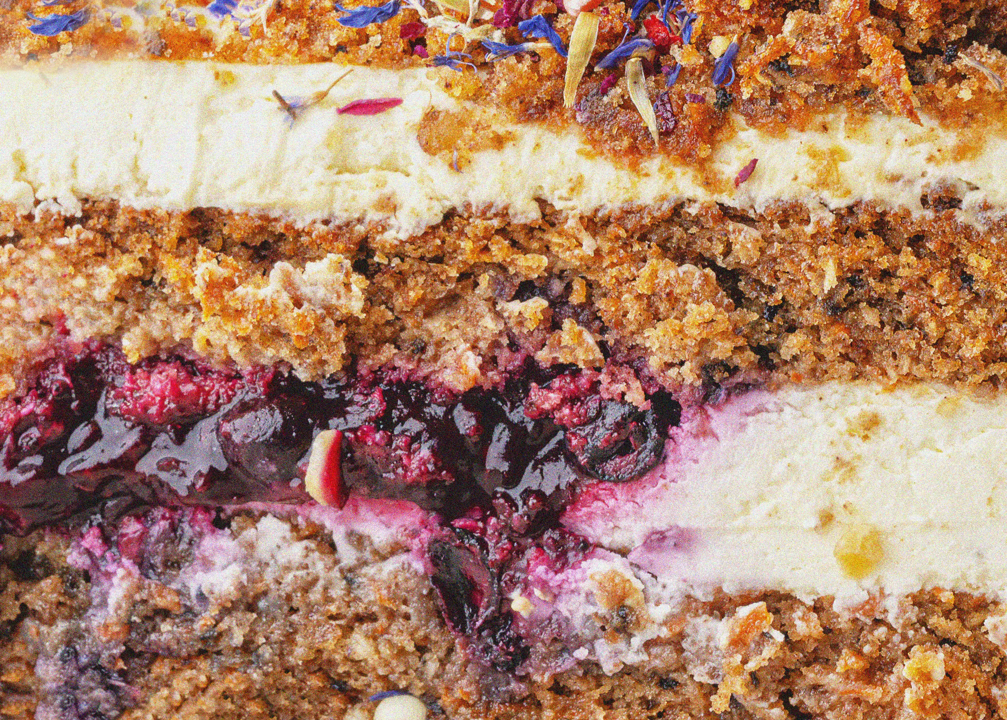
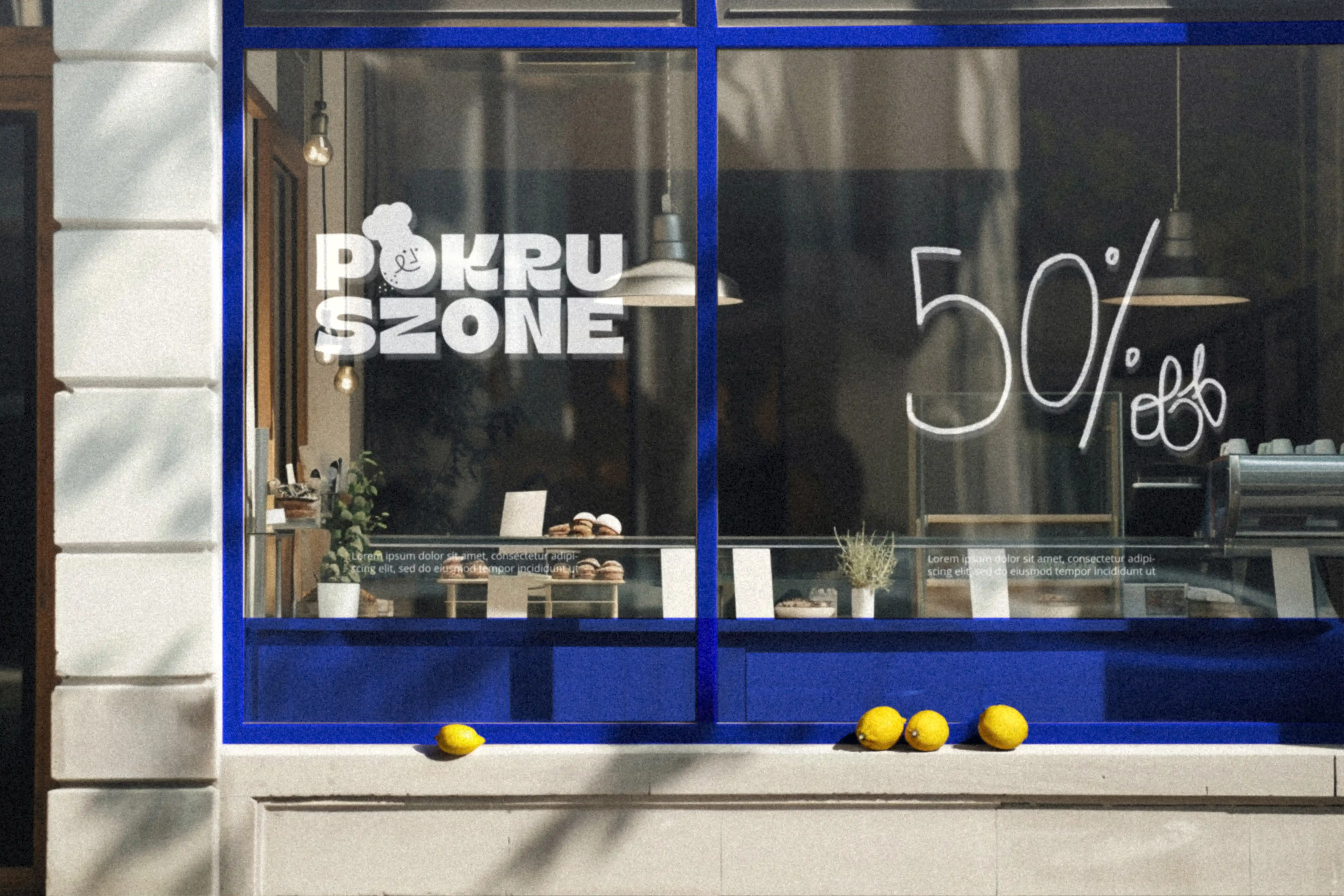
Based in Wrocław, Pokruszone (Polish for "crumbled") had built a beloved reputation for custom cakes. They approached us for a complete rebranding that could match their serious craftsmanship while celebrating the joyful, sometimes messy, delight of a great dessert. Our challenge was to create a fresh, inviting identity that conveys trust and quality for life's biggest moments—weddings, birthdays, and anniversaries—without losing the playful spirit captured in their name. The result is a vibrant and memorable aesthetic built on a foundation of trustworthy blue, pure white, and a happy pop of yellow.
Scope of Work
Branding / Packaging / Photography
Client
Pokruszone
Year
2024